Voxengo GlissEQ
Primary User Guide (PDF): English, Français, Deutsch, Русский язык
Applications
- Audio track equalizer
- Audio mastering equalizer
- Dynamic equalizer
- Stereo, mono, mid-side equalizer
- 7.1, 5.1 surround sound equalizer
- FFT spectrum analyzer (SPAN-like)
- Multi-track spectrum comparison
- Transparent equalizer
- Smooth harmonic enhancer
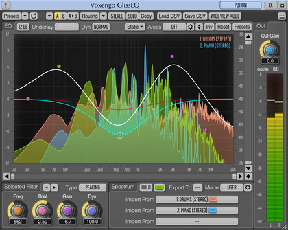
GlissEQ is a parametric equalizer AAX, AudioUnit, and VST plugin for professional sound and music production applications. The most interesting and unique feature of GlissEQ is the dynamic behavior of its filters.
To understand dynamic filtering, let’s begin by re-stating something probably obvious about a normal equalizer: you always get what you set. In other words, when you specify a 6 dB boost at 100 Hz you get exactly 6 dB of boost at 100 Hz.
But GlissEQ is different. When you specify a 6 dB boost at 100 Hz, you don't necessarily get a 6 dB increase in gain. Instead, the filter’s effective gain is adjusted dynamically according to the program material. That is what we mean by dynamic filtering and it is the key to GlissEQ.
You should notice these immediate benefits: boosting highs with GlissEQ tends to avoid the fatiguing effect of overload. And boosting lows avoids making things sound mushy. Instead, you get a pleasant emphasis of transients, bringing life and dimension to your tracks. In short, the “dynamic behavior” of GlissEQ’s filters gives you a helping-hand during mixing and mastering.
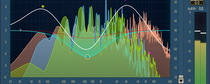
In addition to dynamic filtering, GlissEQ also features a real-time spectrum analyzer. The spectrum of a track can be exported to any other instance of GlissEQ thus making real-time inter-track spectrum comparisons possible. This helps you free frequency ranges on one track to allow an instrument on another track occupying same frequencies to breathe.